
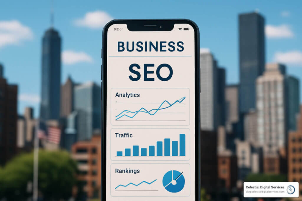
Mobile-Friendly Website SEO: 7 Powerful Ways to Win in 2025
Why Mobile-Friendly Website SEO Is Your Business Lifeline
Related posts you may find interesting


Mobile-friendly website SEO is the art of making sure your pages rank well and feel effortless on phones and tablets. With 58 % of Google searches now mobile and the search giant using only your mobile version for ranking, a slick handheld experience is no longer optional—it is your visibility.
Key mobile SEO essentials:
* Responsive design – one URL that adapts to every screen
* Page speed – aim for sub-1-second loads
* Core Web Vitals – healthy LCP, INP and CLS scores
* Mobile usability – 48 px tap targets, readable fonts, zero intrusive pop-ups
* Structured data – rich snippets that pop on cramped screens
If your site fails Google’s mobile-friendly test, expect ranking drops and impatient visitors. Brands that accept mobile optimisation capture the 60 %+ of traffic already browsing on phones while leaving competitors stuck on the desktop era.
As a digital marketing specialist who’s helped dozens of small businesses turn slow, clunky sites into lead machines, I can confirm the payoff: faster growth, higher conversion rates and stronger local visibility all start with a responsive, lightning-fast mobile site.

Quick look at mobile-friendly website seo:
* optimize website speed
* google algorithm updates
* optimize for voice search
Why Mobile SEO Matters in 2024
More than half of your prospects now find businesses on a phone. Google counts 27.8 billion more mobile than desktop queries and, with a 100 % mobile-first index, judges your rankings solely on the mobile experience—even for desktop searches.
Google also recommends mobile pages load in under 1 second. Shoppers leave within three if you miss that mark, and 90 % use smartphones to research purchases while standing in a store aisle. In short, mobile experience = revenue.
What Is Mobile SEO?
Mobile SEO ensures that content, navigation and speed on handheld devices equal—or surpass—desktop quality. It’s about touch-friendly design, fast delivery on shaky connections and readable text without pinching or zooming.
Impact of Google’s Mobile-First Indexing
The mobile Googlebot now crawls only your responsive version. Sites with identical mobile and desktop content, clear navigation and solid speed scores win ranking increases; those offering a stripped-down “lite” mobile version see traffic evaporate.
Businesses that invested early have already taken market share. For everyone else, 2024 is the red-line deadline: fix mobile or fade from search.
Building a Mobile-Friendly Website SEO Foundation
Creating a site that thrives on every screen starts with the right configuration:
| Configuration | Pros | Cons | SEO Impact |
|---|---|---|---|
| Responsive | Single URL, simple upkeep | Requires CSS know-how | Google-preferred |
| Dynamic serving | Device-specific HTML | Complex server logic | Works if flawless |
| Separate m-dot | Custom design | Duplicate-content risk, redirects | Hardest to manage |
Responsive design is the clear winner for most small businesses. One codebase, one URL and Google’s stated preference keep things straightforward.
Responsive Design: Google’s Favourite
Add the viewport tag:
html

<meta name="viewport" content="width=device-width, initial-scale=1">
and use CSS media queries to resize elements fluidly. Because every device sees the same URL, you avoid split link equity and ensure content parity by default. For speed tips, see our guide to Optimize Website Speed.
Testing Mobile Friendliness
- Run Google’s Mobile-Friendly Test.
- Check ongoing errors in Search Console’s Mobile Usability report.
- Audit performance with Lighthouse.
- Get a second opinion from Bing’s checker.
- Finally, grab a real phone and click around—nothing beats live testing.
Fixing Common Mobile SEO Issues & Boosting Speed
Half your visitors vanish if a page needs more than three seconds to load, and Google now factors these delays directly into rankings. Primary culprits: uncompressed images, bloated CSS/JS and pop-ups that hijack the display.
Start with Google PageSpeed Insights. It lists the worst offenders and suggests fixes.
Core Web Vitals & Page Speed Best Practices
- Largest Contentful Paint (LCP) < 2.5 s – optimise hero images, enable a CDN.
- Interaction to Next Paint (INP) < 200 ms – trim JavaScript, minimise main-thread work.
- Cumulative Layout Shift (CLS) < 0.1 – reserve space for images/video before load.
Quick wins: lazy-load images below the fold, compress assets, enable browser caching and GZIP/ Brotli.
User Experience Tweaks That Boost Rankings
- Body text ≥ 16 px; high colour contrast.
- Tap targets ≥ 48 px, spaced apart.
- Simple vertical menus—no microscopic dropdowns.
- Break paragraphs into scannable chunks and avoid intrusive pop-ups (Google penalises them).
Advanced Techniques for mobile-friendly website seo Success
Once the basics are solid, advanced tactics lift you above the pack.
Structured Data & Rich Snippets on Mobile
Implement JSON-LD Schema.org structured data for products, local business info and FAQs. Rich snippets occupy more mobile real estate, lifting click-through rates by up to 40 %.
Optimising Titles, Descriptions & CTR
Mobile screens truncate early. Keep titles 50-60 characters, lead with the primary keyword, and craft descriptions under 105 characters. Monitor pages with high impressions but low CTR in Search Console and iterate.
Preparing for Voice & “Near Me” Searches
Voice queries are conversational. Build concise FAQ sections that match natural questions and ensure your Google Business Profile is complete. Local schema plus neighbourhood keywords secure “near me” visibility.
For deeper tactics, read our guide on Optimize for Voice Search.
Frequently Asked Questions about Mobile-Friendly Website SEO
How can I tell if my site is truly mobile-friendly?
Combine Google’s Mobile-Friendly Test with Search Console’s Mobile Usability report, then verify on real devices. Make sure pages load fast, text is readable and buttons are easy to tap.
Which Core Web Vitals matter most on mobile?
Prioritise LCP (< 2.5 s) for perceived speed, followed by INP (< 200 ms) for touch responsiveness and CLS (< 0.1) for layout stability.
Do I still need AMP in 2024?
Usually not. Modern responsive techniques, 5G networks and Core Web Vitals optimisation deliver comparable speed without AMP’s design limits. Publishers with massive traffic may still benefit, but most local businesses should focus on a single, fast responsive site.
Conclusion
Mobile-friendly website SEO separates thriving brands from forgotten ones. A responsive build, healthy Core Web Vitals and touch-first design earn rankings and conversions.
Celestial Digital Services simplifies the technical work so startups and local businesses can focus on customers. Need a step-by-step roadmap? Grab our guide: SEO for Beginners: Easy Strategies to Increase Your Website Traffic.
Every day you delay optimisation is a day prospects choose a faster competitor. Let’s make sure they find—and enjoy—your site first.
